top of page
Portfolio
Selected Work

01
The Life Alchemist — Brand Identity Design
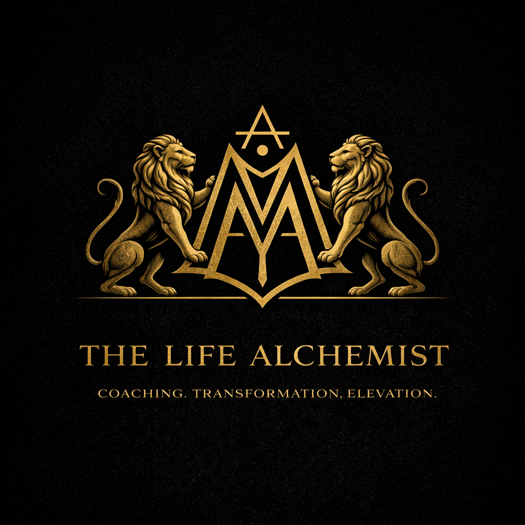
A luxury brand identity created for The Life Alchemist, a transformational coaching practice rooted in personal evolution, elevation, and self-mastery.
The visual direction blends masculine strength with spiritual symbolism, anchored by a custom monogram built from the initials “A” and “M” — subtly referencing the affirmation “I AM.” This central mark is supported by twin heraldic lions, representing power, leadership, and inner authority.
The identity is executed in a refined gold-on-black palette, paired with timeless serif typography to create a sense of prestige, clarity, and permanence. Every element was intentionally simplified to move away from ornate, mystical clichés and toward a more modern, editorial luxury aesthetic.
The result is a brand system that feels both grounded and aspirational — designed to resonate with individuals seeking transformation while maintaining credibility within a high-end coaching space.

02
Eunoia Elixirs — Brand Identity & Packaging Design
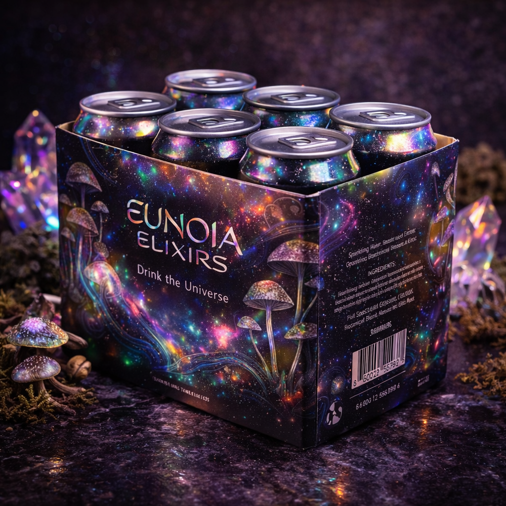
A conceptual luxury beverage brand exploring the intersection of wellness, consciousness, and elevated product design.
The identity is rooted in the meaning of “eunoia” — beautiful thinking — and translates that idea into a visual system that feels cosmic, iridescent, and immersive. Moving away from traditional cannabis and mushroom branding, the direction intentionally avoids cliché visuals in favor of holographic textures, aurora-inspired color shifts, and refined, modern typography.
The project extends across a full packaging system — including front and back can design, multi-pack packaging, and brand applications — creating a cohesive, retail-ready experience. The result is a forward-thinking wellness brand that positions itself within a high-end, editorial space while maintaining a sense of curiosity, depth, and transformation.

03
LUNE— Luxury Fashion Brand Identity
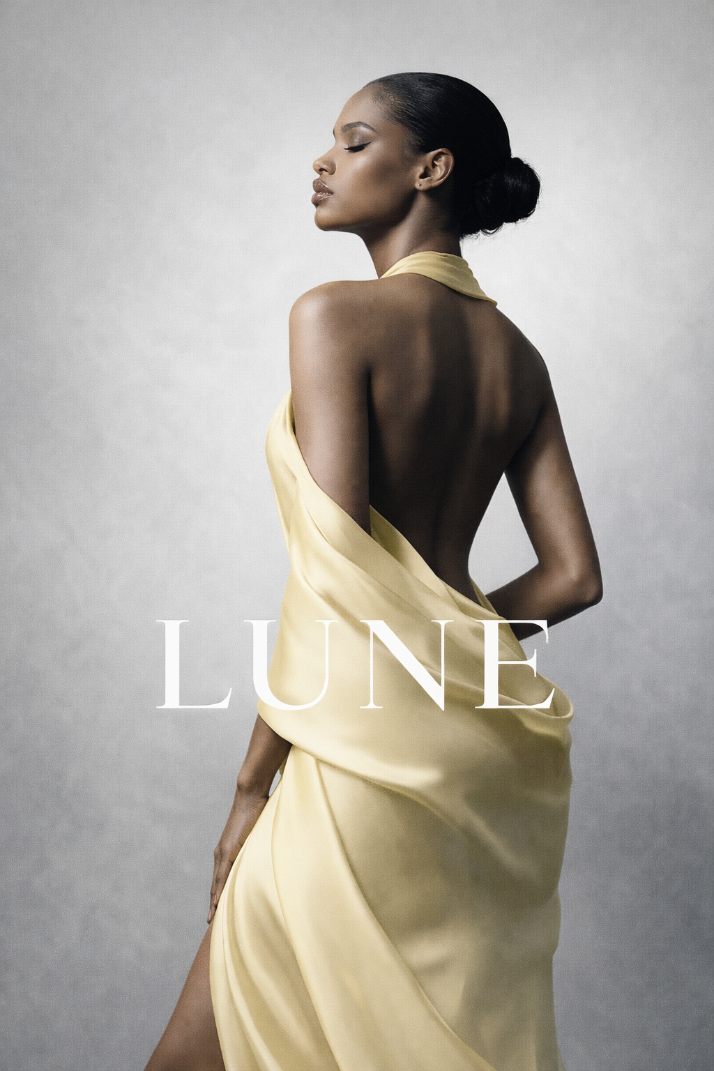
LUNE is a modern luxury fashion concept defined by restraint, contrast, and quiet confidence. Rooted in editorial minimalism, the brand focuses on sculptural silhouettes, refined composition, and a cool-toned palette that elevates form over excess. Every element is intentional — creating a visual identity that feels sophisticated, controlled, and effortlessly high-end.

04
Golden Press — Premium Wine Brand Identity
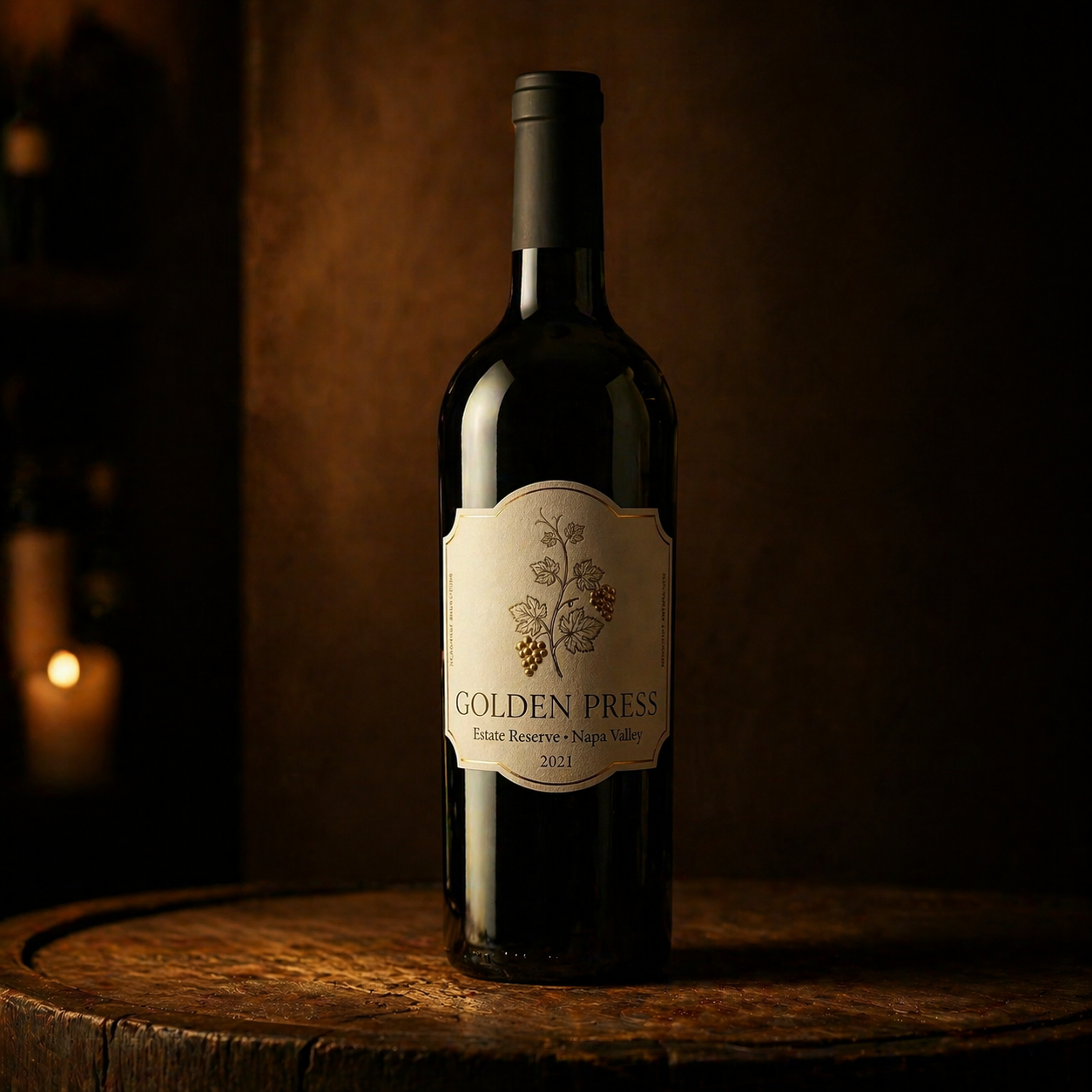
A luxury wine branding concept rooted in tradition, craftsmanship, and timeless elegance. Golden Press was designed to evoke the quiet sophistication of Napa Valley alongside the heritage of European winemaking.
The identity centers around a refined label system featuring delicate botanical grape illustrations, soft cream textures, and understated gold detailing. Paired with deep, rich tones and minimal typography, the design creates a sense of balance between heritage and modern restraint.
From the bottle presentation to the surrounding visual language, every element was crafted to feel intentional, warm, and enduring — capturing the essence of a premium wine experience that is both elevated and approachable.
This project highlights brand identity, packaging design, and art direction, with a focus on creating a cohesive, high-end visual system that feels timeless rather than trend-driven.

05
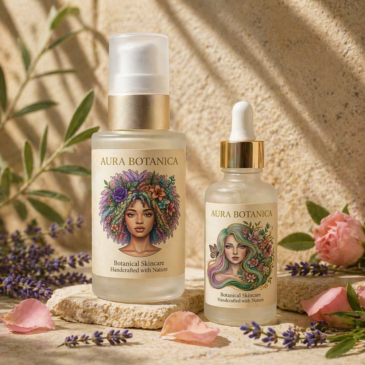
Aura Botanica — Botanical Skincare Brand Identity
A refined, nature-inspired skincare concept designed to embody softness, femininity, and elevated simplicity. Aura Botanica explores the harmony between botanical elements and modern beauty through thoughtful illustration and minimal product design.
The visual identity is anchored by two distinct yet cohesive label illustrations — one bold and grounded, the other soft and ethereal — representing different expressions of natural beauty within the same brand. Paired with frosted glass packaging, warm neutral tones, and delicate botanical styling, the system creates a calm, luxurious presence that feels both organic and editorial.
This project highlights brand storytelling through illustration, packaging design, and art direction — balancing softness with clarity to create a skincare experience that feels intentional, serene, and elevated.

06
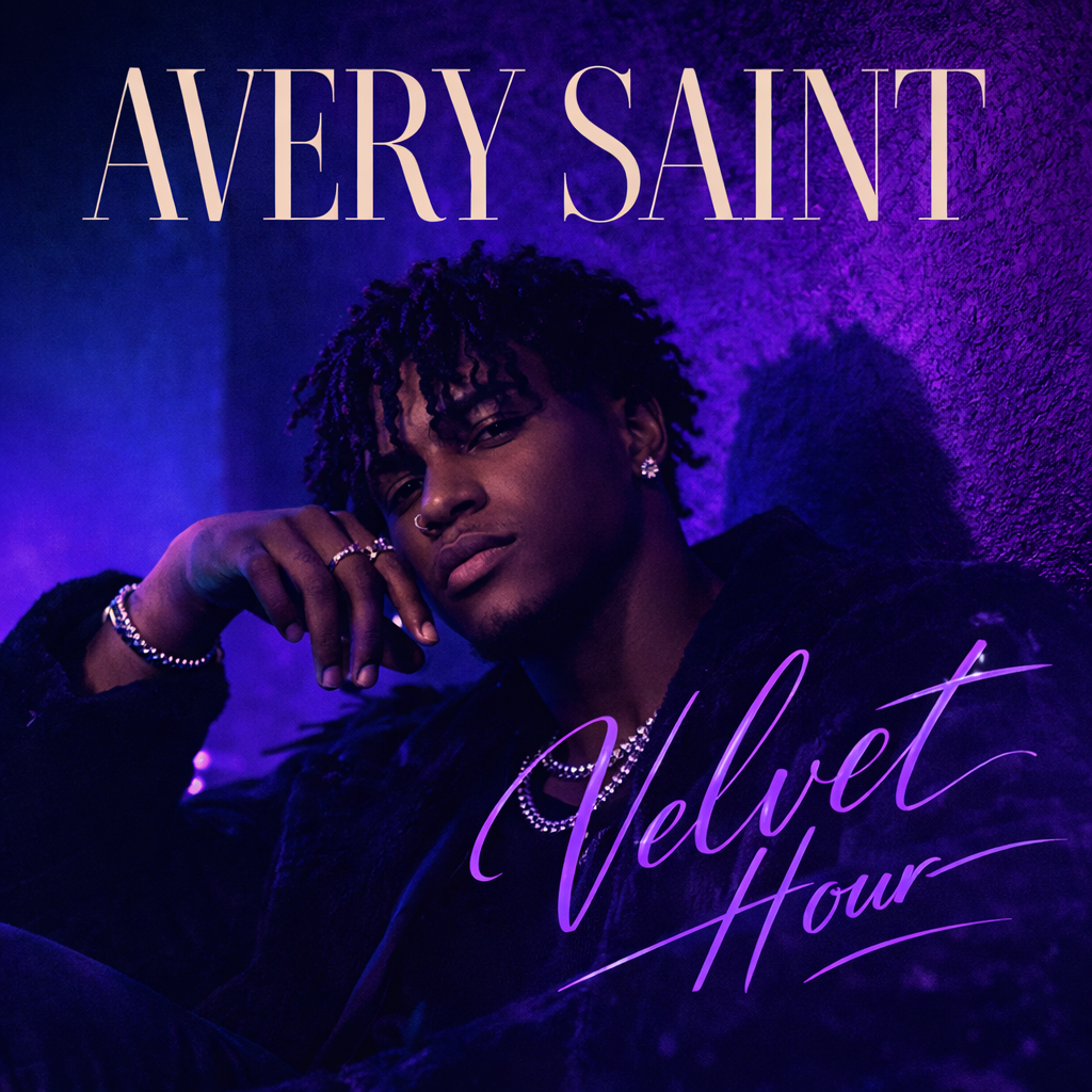
Velvet Hour — Album Cover & Visual Identity
A luxury R&B album concept created for the artist Avery Saint, Velvet Hour explores the intersection of music, mood, and visual storytelling.
The direction centers on a modern, editorial portrait — using deep blue and purple tones to evoke late-night intimacy, emotional depth, and contemporary R&B culture. Typography was intentionally treated as part of the composition, with the artist’s name taking prominence and the album title remaining subtle, mirroring real-world music industry hierarchy.
This project extends beyond a single cover, developing into a cohesive visual system including streaming assets, brand colors, and promotional applications — designed to feel current, elevated, and culturally relevant.

07
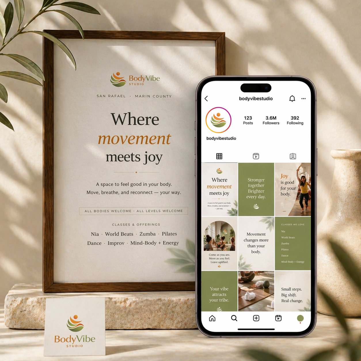
Body Vibe Studio - Brand Identity & Social Media Design
A refined brand and social media transformation for Body Vibe Studio, designed to elevate its presence with clarity, warmth, and intention. This project focused on translating the studio’s energy—movement, connection, and joy—into a cohesive visual identity across digital platforms.
The direction blends soft neutrals with grounded, earthy tones to create a calm yet inviting aesthetic, while structured layouts and intentional typography bring a sense of professionalism and ease. From branded flyers to a curated Instagram feed, each element was designed to feel aligned, welcoming, and visually consistent.
The result is a polished, lifestyle-driven brand presence that not only reflects the studio’s values but also strengthens its connection with its community through thoughtful, elevated design.

08
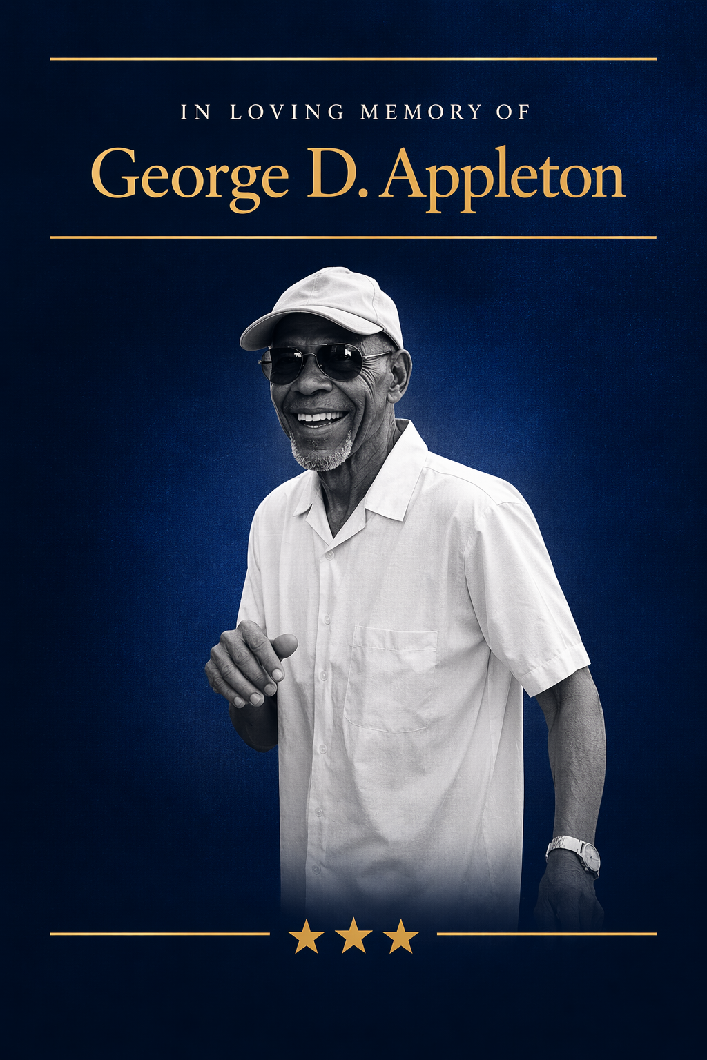
George D. Appleton Memorial Design Suite
A dignified and elevated memorial design created to honor the life and legacy of George D. Appleton — a military veteran, family man, and pillar of strength.
This project explores how thoughtful design can support moments of remembrance with clarity, respect, and beauty. The visual system draws from a military-inspired palette of deep navy, steel blue, and gold, paired with refined typography and a fine art black-and-white portrait treatment.
The result is a cohesive memorial suite — including a funeral program, keepsake card, apparel design, and service materials — designed to feel timeless, honorable, and deeply personal.
01 / 08
The Life Alchemist — Brand Identity Design
A luxury brand identity created for The Life Alchemist, a transformational coaching practice rooted in personal evolution, elevation, and self-mastery.
The visual direction blends masculine strength with spiritual symbolism, anchored by a custom monogram built from the initials “A” and “M” — subtly referencing the affirmation “I AM.” This central mark is supported by twin heraldic lions, representing power, leadership, and inner authority.
The identity is executed in a refined gold-on-black palette, paired with timeless serif typography to create a sense of prestige, clarity, and permanence. Every element was intentionally simplified to move away from ornate, mystical clichés and toward a more modern, editorial luxury aesthetic.
The result is a brand system that feels both grounded and aspirational — designed to resonate with individuals seeking transformation while maintaining credibility within a high-end coaching space.
01
The Life Alchemist — Brand Identity Design
A luxury brand identity created for The Life Alchemist, a transformational coaching practice rooted in personal evolution, elevation, and self-mastery.
The visual direction blends masculine strength with spiritual symbolism, anchored by a custom monogram built from the initials “A” and “M” — subtly referencing the affirmation “I AM.” This central mark is supported by twin heraldic lions, representing power, leadership, and inner authority.
The identity is executed in a refined gold-on-black palette, paired with timeless serif typography to create a sense of prestige, clarity, and permanence. Every element was intentionally simplified to move away from ornate, mystical clichés and toward a more modern, editorial luxury aesthetic.
The result is a brand system that feels both grounded and aspirational — designed to resonate with individuals seeking transformation while maintaining credibility within a high-end coaching space.
02
Eunoia Elixirs — Brand Identity & Packaging Design
A conceptual luxury beverage brand exploring the intersection of wellness, consciousness, and elevated product design.
The identity is rooted in the meaning of “eunoia” — beautiful thinking — and translates that idea into a visual system that feels cosmic, iridescent, and immersive. Moving away from traditional cannabis and mushroom branding, the direction intentionally avoids cliché visuals in favor of holographic textures, aurora-inspired color shifts, and refined, modern typography.
The project extends across a full packaging system — including front and back can design, multi-pack packaging, and brand applications — creating a cohesive, retail-ready experience. The result is a forward-thinking wellness brand that positions itself within a high-end, editorial space while maintaining a sense of curiosity, depth, and transformation.
03
LUNE— Luxury Fashion Brand Identity
LUNE is a modern luxury fashion concept defined by restraint, contrast, and quiet confidence. Rooted in editorial minimalism, the brand focuses on sculptural silhouettes, refined composition, and a cool-toned palette that elevates form over excess. Every element is intentional — creating a visual identity that feels sophisticated, controlled, and effortlessly high-end.
04
Golden Press — Premium Wine Brand Identity
A luxury wine branding concept rooted in tradition, craftsmanship, and timeless elegance. Golden Press was designed to evoke the quiet sophistication of Napa Valley alongside the heritage of European winemaking.
The identity centers around a refined label system featuring delicate botanical grape illustrations, soft cream textures, and understated gold detailing. Paired with deep, rich tones and minimal typography, the design creates a sense of balance between heritage and modern restraint.
From the bottle presentation to the surrounding visual language, every element was crafted to feel intentional, warm, and enduring — capturing the essence of a premium wine experience that is both elevated and approachable.
This project highlights brand identity, packaging design, and art direction, with a focus on creating a cohesive, high-end visual system that feels timeless rather than trend-driven.
05
Aura Botanica — Botanical Skincare Brand Identity
A refined, nature-inspired skincare concept designed to embody softness, femininity, and elevated simplicity. Aura Botanica explores the harmony between botanical elements and modern beauty through thoughtful illustration and minimal product design.
The visual identity is anchored by two distinct yet cohesive label illustrations — one bold and grounded, the other soft and ethereal — representing different expressions of natural beauty within the same brand. Paired with frosted glass packaging, warm neutral tones, and delicate botanical styling, the system creates a calm, luxurious presence that feels both organic and editorial.
This project highlights brand storytelling through illustration, packaging design, and art direction — balancing softness with clarity to create a skincare experience that feels intentional, serene, and elevated.
06
Velvet Hour — Album Cover & Visual Identity
A luxury R&B album concept created for the artist Avery Saint, Velvet Hour explores the intersection of music, mood, and visual storytelling.
The direction centers on a modern, editorial portrait — using deep blue and purple tones to evoke late-night intimacy, emotional depth, and contemporary R&B culture. Typography was intentionally treated as part of the composition, with the artist’s name taking prominence and the album title remaining subtle, mirroring real-world music industry hierarchy.
This project extends beyond a single cover, developing into a cohesive visual system including streaming assets, brand colors, and promotional applications — designed to feel current, elevated, and culturally relevant.
07
Body Vibe Studio - Brand Identity & Social Media Design
A refined brand and social media transformation for Body Vibe Studio, designed to elevate its presence with clarity, warmth, and intention. This project focused on translating the studio’s energy—movement, connection, and joy—into a cohesive visual identity across digital platforms.
The direction blends soft neutrals with grounded, earthy tones to create a calm yet inviting aesthetic, while structured layouts and intentional typography bring a sense of professionalism and ease. From branded flyers to a curated Instagram feed, each element was designed to feel aligned, welcoming, and visually consistent.
The result is a polished, lifestyle-driven brand presence that not only reflects the studio’s values but also strengthens its connection with its community through thoughtful, elevated design.
08
George D. Appleton Memorial Design Suite
A dignified and elevated memorial design created to honor the life and legacy of George D. Appleton — a military veteran, family man, and pillar of strength.
This project explores how thoughtful design can support moments of remembrance with clarity, respect, and beauty. The visual system draws from a military-inspired palette of deep navy, steel blue, and gold, paired with refined typography and a fine art black-and-white portrait treatment.
The result is a cohesive memorial suite — including a funeral program, keepsake card, apparel design, and service materials — designed to feel timeless, honorable, and deeply personal.
A curated collection of brand, visual, and storytelling work—each piece designed with intention, clarity, and emotional depth.
From identity to digital presence, every project reflects a balance of strategy, aesthetics, and aligned creative direction.
bottom of page